It is probably 6:52pm on a Tuesday, and you're thinking: Who is this Rob Fenech guy?
I'm afreelance web designer
As a long standing, award winning freelance web designer in London, I specialise in delivering exceptional digital solutions to a diverse clientele, spanning from dynamic startups and thriving SMEs to prominent corporate entities. Are you seeking a web designer who can optimise your website's performance and maximize its potential? Let's chat and get you a website that produces results.
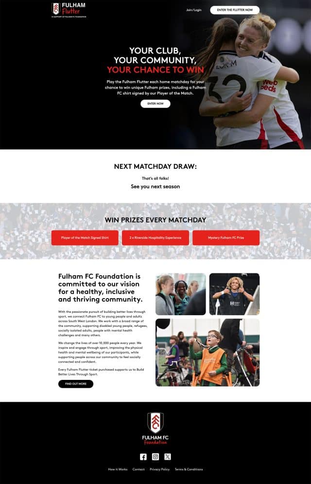
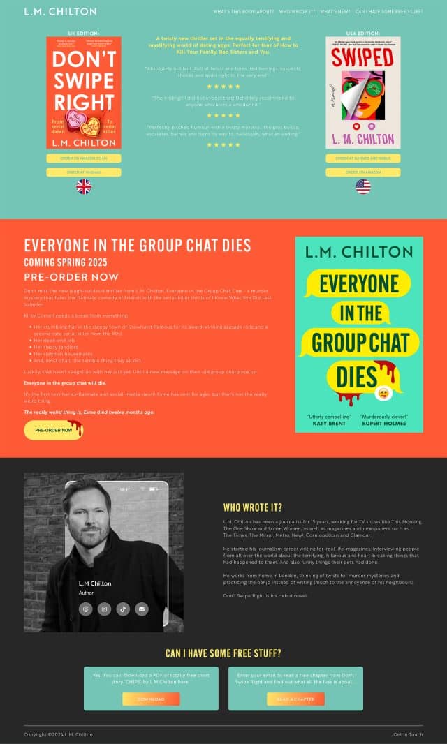
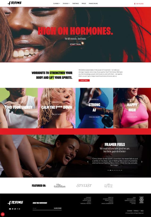
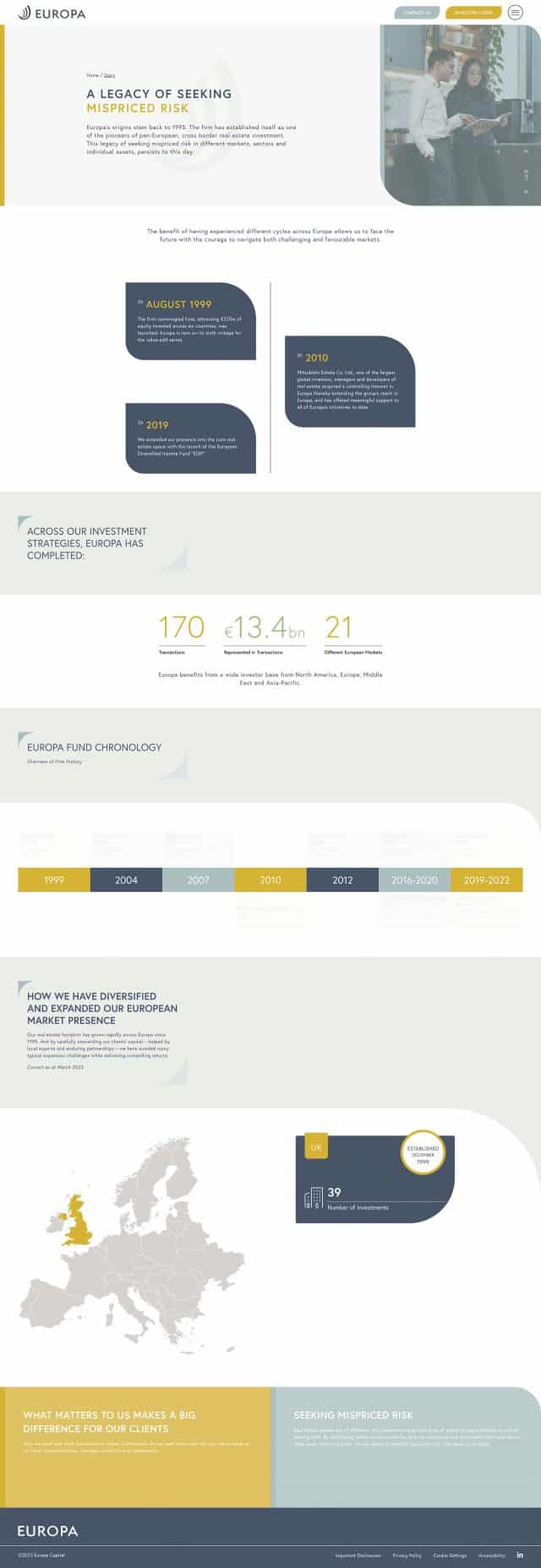
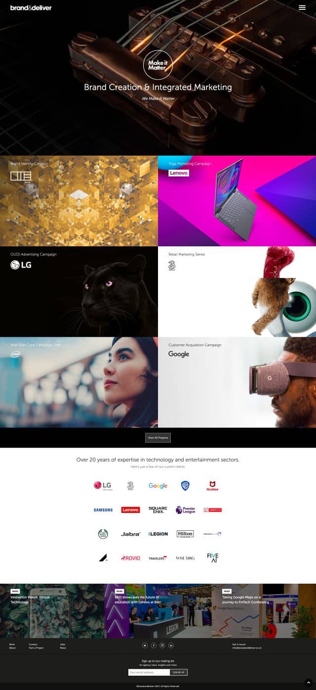
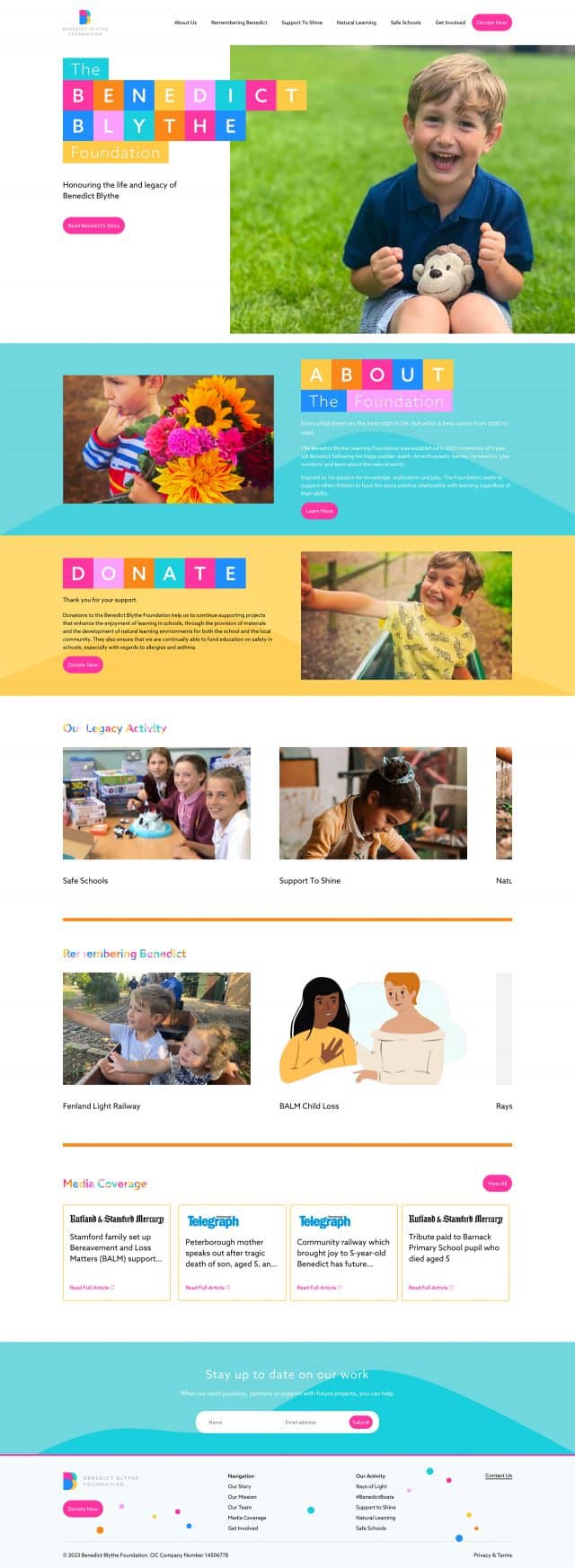
Some of my recent web design projects (or in other words, my portfolio)
Freelance Web Designer
Who also does a lot of other bits and bobs
Web Design in London (and beyond)
The landscape of web design has undergone significant transformations in recent years. Today, crafting a remarkable website goes beyond mere aesthetics for your audience. It involves employing a creative strategy that seamlessly blends your business goals with industry best practices to captivate and engage your users.
As a freelance website designer, my primary objective is to deliver tangible returns on your investment. While ensuring an impressive visual appeal is a given, I recognise that contemporary design surpasses mere superficial beauty. Feel free to explore my portfolio to witness the evolution firsthand. Discover more here, where you’ll find examples of my work.
Web Development and WordPress Development
I approach web development with utmost seriousness and professionalism. While the inner workings of a website may go unnoticed by the average user, they form the foundation of its performance. Being a freelance web designer doesn’t mean we ignore great development practices. For instance, is your website optimised for speed? You can easily assess its speed using Google’s page speed checker. I prioritise writing clean, organised, and functional code, resulting in a high-performing website that delivers a seamless user experience. Furthermore, it’s important to note that once the website is completed, you retain full ownership of the code, providing you with complete control and flexibility.
E-Commerce, WooCommerce and Online Stores
My dedication lies in truly immersing myself in your business, comprehending your goals and aspirations. By gaining a profound understanding of your company and industry, I ensure the delivery of an exceptional e-commerce website that transcends the ordinary, becoming a captivating digital journey.
As a seasoned freelance web designer, I hold firm to the belief that your e-commerce site should set the benchmark, surpassing the competition and raising the industry standard. Prepare to witness a website that not only outshines your rivals but also leaves a lasting impression on your target audience. Their attempts to match its caliber will be in vain.
SEO (Search Engine Optimisation)
When the topic of SEO arises, the primary inquiry on everyone’s mind is, “How can I secure the top position on Google for my targeted keywords?” The reality is that achieving this coveted spot entails more than a simple magic formula. If it were always that easy, I’d be permanently top for the keyword freelance web designer – but I often bounce around the first page. That is the nature of the sector. Anybody telling you they can 100% guarantee results should be avoided at all costs. It’s a case of improvements on an ongoing basis, there is no magic bullet.
Any competent developer understands the intricacies involved. However, I possess extensive knowledge and expertise in SEO, allowing me to optimise your website’s title tags, heading tags, and keywords to perfection. By meticulously fine-tuning these elements, I significantly enhance your chances of reaching that desired pinnacle on Google or any other search engine.
Rest assured, I employ the best practices and strategies that maximise your website’s visibility and organic search rankings. With my SEO proficiency, your website will be well-positioned to outshine competitors and attract valuable organic traffic, driving your online success.
Copywriting and Content Generation
Looking for an expert copywriter specialising in website and SEO-optimised content? Look no further! I craft compelling, engaging copy that captivates your audience and boosts online visibility. With expertise in SEO integration, I ensure maximum search engine visibility. I’m a freelance web designer that writes too!
From persuasive landing pages to informative blog posts, I deliver standout content that resonates with your target market. Let’s elevate your website content together and watch your online presence soar. Contact me today to discuss how I can transform your brand with powerful, concise copy.
SaaS (Software as a Service)
Ready to launch your startup? Look no further! As an expert in creating SaaS websites, I specialise in delivering sleek and user-friendly platforms that cater to the unique needs of startups. With my expertise, your website will be crafted to perfection, offering a seamless user experience and empowering you to scale your business rapidly. Get ahead of the competition and bring your startup to life with a SaaS website designed for success. Let’s collaborate and make your entrepreneurial dreams a reality.
About Rob Fenech
Who is this guy who builds websites and stuff?
Who are you and why do you build websites?
I’m Rob and I am a freelance website designer. You already knew that bit though, didn’t you? I go into my detail on my about page, but to give you the top level:
- Freelance Web Designer and Developer with over 20 years experience
- Dad of 3, husband of 1.
- Electric car driver (yep, I care about the environment – ask me about sustainable websites)
- Degree in Advertising, so my web design work comes from a marketing stance
- Works direct with clients and also with agencies
As I say, you can read a lot more about me and my personal life (if that’s your thing, you weirdo!) on my about page, but I’d focus more on my work unless you want to be bored about my interests in golf and crime novels.
But who do you work with?
As I mention above, I love to work with SMEs, startups, entrepreneurs with SaaS products particularly, and of course, I love to work with agencies. Specifically, agencies that maybe don’t have in-house web developers, but are great at design. I find that is always a great fit for me, and for them. So if you are an agency that has some design resource, but no developers, I could be your resource for that service.
The easiest thing to do is to call me on 07540 221 386 for a chat about your project, and we can see if it’s a good fit for us to work together.
Freelance Web Designer FAQs
-
Hiring a freelance web designer is almost always less expensive than hiring an agency since they have fewer overhead costs. They’re also generally more responsive due to the fact that the client will always have direct contact with the freelancer. Freelancers will often specialise in a few distinct skill sets and can assist you in creating anything from tiny brochure site to a large e-commerce website.
-
That’s a difficult question to answer, because the fees for a web designer don’t just depend on the skills and experience of that designer… you also have to consider how in demand that person is. Such factors as location and practice area will determine how much a web designer charges for their services too. I typically take on projects starting from £2,500 plus vat and work upwards from there, depending on the scope of your project.
-
I usually ask for an initial payment in advance, this ranges from 25% to 50% of the total project fee and depends very much on the size of the project. For smaller projects, I will generally do an initial payment followed by a final payment once the site is live. For much bigger projects, it is good to break the payments up into 3 or 4 chunks. This helps with my cashflow, being a freelance web designer, I rely on good cash flow. And it helps you too, as it prevents large sums of money being needed all at once.
-
Depending on the size, complexity, and type of business you want to create, a brochure site might take anywhere from 6 to 8 weeks from start to finish. A more complicated build or an eCommerce website may take anywhere from 8 to 20 weeks depending on the amount of work and how complicated it is.
-
The most important thing is your content and an idea of your site structure. The idea of structure is absolutely necessary, but the content COULD wait. We could use ‘Latin’ text to fill the gaps, or I could get one of my trusted copywriters to help you with this part of the project.
-
Sure thing. If you already have a web designer on board and are searching for a web developer to make it happen, get in touch. My only requirement is that the designer you pick be able to provide me with handover files in a current format such as XD, Sketch, or Figma.
-
Yes. I can provide complete handover documentation using Adobe XD. This means your developer will be able to export all of the assets they need in an SVG format. Easy peasy.
-
Sorry to say, but I don’t work on existing sites. I only really work on new builds, or rebuilds of sites. I can’t help with edits or updates to your existing site unfortunately.
Latest Blog Posts
Green Is the New Fast: Why Sustainable Web Design Is the Future
A few years ago, if you asked someone how green their website was, you’d probably get a confused look. After all, websites live in the cloud, don’t they? They don’t take up space, they don’t burn fossil fuels, and they certainly don’t spew out smoke like an old factory. But the reality is quite different. […]
7 Website Features Every Small Business Needs to Attract Customers
In today’s digital age, your website is the cornerstone of your business’s online presence. For small businesses, a website is often the first point of contact for potential customers. It’s your opportunity to make a lasting impression and convince visitors that your business is the right choice for them. But what exactly makes a small […]
Is your website shit?
Introduction Let’s face it: we’ve all visited a website that’s, well, a bit rubbish. Maybe the design was outdated, the text was full of jargon, or you couldn’t even find the phone number to call. For small businesses, having a subpar website is more than just embarrassing; it’s costing you money. Over my 20+ years […]
Let's work together on your project.
Have I made an impression?
If so, then why not take the next step, which is a totally free indicative quote calculator. My hand coded algorithm asks you a few simple questions, and then will be able to give you a ballpark figure that we can use as a jumping off point for your project. Get a free quote now
